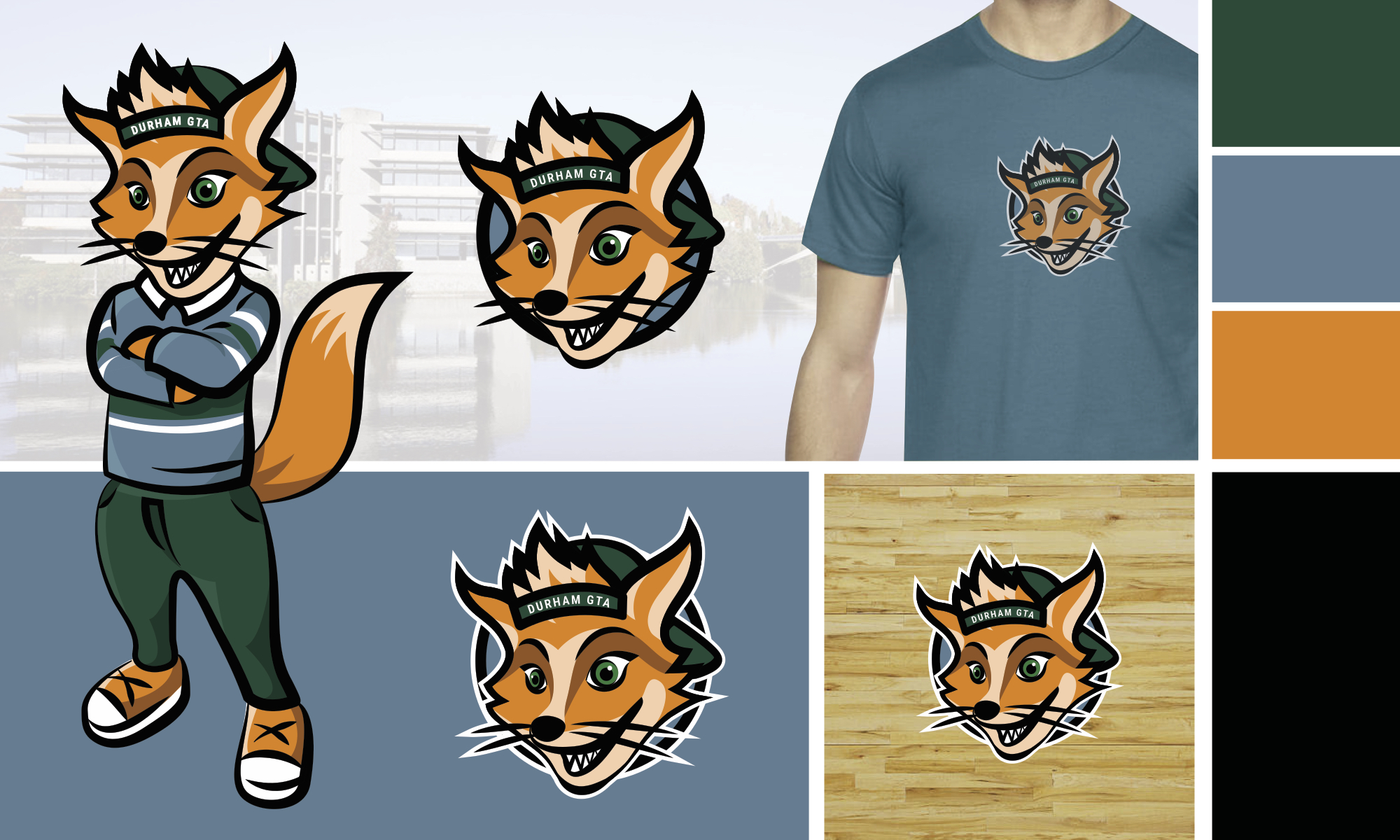
Trent U Mascot
the brand
Trent University Durham campus has a fox mascot named Finn who engages in campus activities and sporting events. Finn needed an online presence for campus use and community event promotion.
the solution
Creating a fun illustration of the full body mascot was important for print purposes, but there also needed to be a badge version for social media or merchandise. This fun cartoony character can now be used everywhere school spirit is needed!
Emma is amazing to work with! She set us up with a great logo, apparel business documents and website design. The process was quick and effortless. She provided professional and […]
Emma had worked as a freelance designer for my fashion brand CAITLIN POWER. Emma was wonderful to work with; she followed direction well, she proposed new and exciting ideas, she […]
We chose to work with Emma because we were looking for a designer who would take the time to understand our brand, our values and what we are looking for. […]
Emma Scott helped me envision a solid brand logo with a fresh, modern style that I needed in order to rebrand my photography business. Her professional, creative approach was matched […]
Emma is a talented and skilled Graphic Designer based in Peterborough, Ontario. She did a fantastic job designing and perfecting my logo, and it was a pleasure working with her.
Emma Scott built my logo for my cleaning company, Mean Green Clean. First off, she was really fun to work with and really gets engaged in your business. She clearly […]
I’ve worked with Emma on several projects, and without fail she enthusiastically tackled each one with excitement, thoughtfulness & professionalism. Emma is quick to respond to emails & DM’s, & […]
Emma Scott’s been our go to graphic designer since the early days of our business. She understands our aesthetic and brand personality like no one else and has delivered the […]
I am so pleased that I had the opportunity to work with Emma! Communicating with her was effortless – she was very clear about what she needed from me, she […]